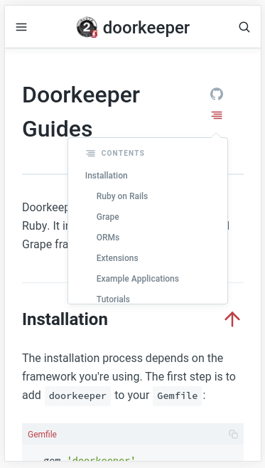
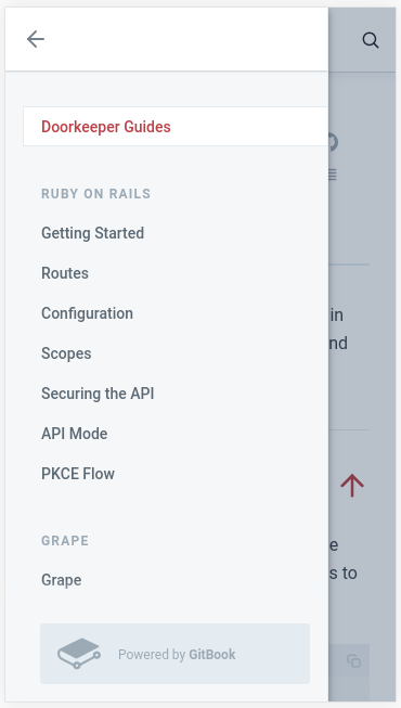
And also for the docs, maybe we have to re-structure the menus so it’s easier to navigate the guides. Make it simpler like https://reactjs.org or git books.
And also for the guides, I think the guides are too many words, maybe we can make it shorter.
Sorry I can not edit my previous message. This is the git books link: https://docs.gitbook.com as the sample of the structure of the menu. I just think the menu is easier to be used.
I think Rails guides is confusing, specially for newcomers. I remember struggling to understand it on my first days of Rails. Ideally, the guides should be easy to use and friendly to newcomers, searchable (I currently use google) and show the Rails version somewhere.
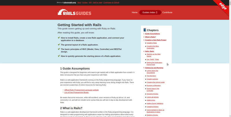
The website looks modern to us, an old design would something more like this.
And also for the docs, maybe we have to re-structure the menus so it’s easier to navigate the guides. Make it simpler like https://reactjs.org or git books.
A matter of opinion too. We have a guides selector, and a sidebar for sections. I mean, you can always polish and iterate things, and perhaps you personally would prefer another navigation UI, but the current layout is fine for us.
And also for the guides, I think the guides are too many words, maybe we can make it shorter.
I think it might also be important to note that the guides don't intend to
be exhaustive reference or a cookbook, but a high level guide to what the
framework provides for customization and where to look next.
The version is the current stable version as a default with previous
versions still available via the path,
eg Ruby on Rails Guides
The first one is the drop-down on the top. Which is the menu to navigate between pages.
The second one is the chapters menu. Which is the menu to navigate between title inside a page.
We have to make those sticky, so it will be easier to navigate.
The condition now, the menu is not sticky and not working well when displayed on the mobile screen. Making it hard to navigate the guides.